
Use Class Helpers
Our v3 Page Editor allows you to easily change and control everything about your website. For those who want a bit more customization, we've added a few helpful pre-defined classes to assist you.
What is a Class?
A class, when added to a row, column, or block, can trigger specific styles based on the CSS in your campaign. In Raisely, there are ready-to-use class styles, or you can create your own via the Custom Styles found in your design settings or accessed from the page builder.
Adding a Class
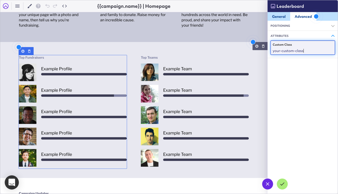
You can add a Custom Class to any row, column, or block in the Page Builder:
- Rows: Select the ⚙️ Settings icon on the Row > Advanced tab > Attributes > then add the Custom Class.
- Columns: Select the ⚙️ Settings icon on the Row > Columns tab > expand the Column you wish > then add the Custom Class.
- Blocks: Select the ⚙️ Settings icon on the Block > Advanced tab > Attributes > then add the Custom Class.
Row Class Helpers
This is to be used on a specific Row.
-
row--full-width: Makes a Row the full width of the screen. -
row--fill-viewport: Row fills at least the entire viewport height (100vh). -
row--three-quarters-viewport: Fills at least 75% of the viewport height. -
row--half-viewport: Fills at least 50% of the viewport height. -
row--quarter-viewport: Fills at least 25% of the viewport height. -
row--border: Adds a border to top and bottom. -
row--border-top: Adds a border to the top. -
row--border-bottom: Adds a border to the bottom. -
row--bg-contain: Background color within 1100px container. -
row--bg-half: Background fills half of row (defaults to left). -
row--bg-right: Places background image on right when used withrow--bg-half. -
row--bg-left: Places background image on right when used withrow--bg-half. -
align-center--mb: Centers content on mobile. -
align-center--tb: Centers content on tablet.
Block Class Helpers
This is to be used on a specific block.
-
block--fill-viewport: Block fills 100% of viewport height. -
block--three-quarters-viewport: Fills 75% of viewport height. -
block--half-viewport: Fills 50% of viewport height. -
block--quarter-viewport: Fills 25% of viewport height. -
block--background-primary: Uses brand primary background color. -
block--color-primary: Uses brand primary text color. -
block--box: Adds padding box around block. -
block--box-top,block--box-middle,block--box-bottom: Padding boxes for specific block regions. -
block--border-top,block--border-right,block--border-bottom,block--border-left: Adds 1px border to respective side.
Display Class Helpers
-
show--logged-out: Show content when user is logged out. -
hide--logged-out: Hide content when user is logged out. -
show--logged-in: Show content when user is logged in. -
hide--logged-in: Hide content when user is logged in. -
show--owned: Show if user owns current profile. -
hide--owned: Hide if user owns current profile. -
show--is-client: Show on live site only. -
show--is-editor: Show only in editor.
Text Class Helpers
This is to be used on the paragraph block.
-
links--color-inherit: By default, links use the color set in Design > Fonts. This class ensures that any links will instead use the default text color of their container. -
smallest,smaller,small: Scale text to 65%, 75%, 85% respectively. -
large,larger,largest: Scale text to 115%, 125%, 135% respectively.
Button Class Helpers
This is to be used on a row, column or the specific button respectively.
-
buttons--full: Makes all buttons full width. -
buttons--half: Makes all buttons at least 50% width. -
buttons--small: Reduces button size. -
button--full,button--half,button--small: Applies same styles to individual buttons.
Using Conditional Class Helpers
Use handlebars-style conditional logic in the Custom Class field to dynamically show or hide content based on user or profile data.
<code>{{#gt current.profile.donorCount 0}}show{{else}}hide{{/gt}}
Supported operators:
eq, if, gt, gte, lt, lte
Text values must be wrapped in quotes:
'true'
Numerical values do not need to be wrapped in quotes:
100
Syntax errors may prevent the page from loading, so test changes carefully.
For a more detailed reference to conditional class helpers, refer to our Advance Merge Fields support article.
Conditional Class Helper Examples by Page Context
📄 Table: Page Context and Field Formatting
| Scenario | Data Table to Reference | Example |
|---|---|---|
| Dashboard - User info |
user.fieldID
|
user.firstName
|
| Dashboard - Profile info |
user.profile.fieldID
|
user.profile.total
|
| Dashboard - Team info |
user.teamProfile.fieldID
|
user.teamProfile.name
|
| Dashboard - Org info |
user.organisationProfile.fieldID
|
user.organisationProfile.path
|
| Profile page - Profile info |
current.profile.fieldID
|
current.profile.activityTotal
|
| Profile page - Team info |
current.profile.teamProfile.fieldID
|
current.profile.teamProfile.memberCount
|
| Profile page - Org info |
current.profile.organisationProfile.fieldID
|
current.profile.organisationProfile.uniqueDonors
|
| Profile page - User info |
current.profile.user.fieldID
|
current.profile.user.firstName
|
🛠 Common Field IDs
-
firstName: User's first name -
lastName: User's last name -
name: Fundraiser name -
total: Fundraiser total -
totalPercent: % of goal reached -
goal: Fundraiser goal -
donorCount: Number of donations -
uniqueDonors: Unique donors -
activityTotal: Tracked activity total -
activityTotalPercent: Activity goal % -
activityGoal: Activity goal value -
campaignTotal: Total raised in campaign -
memberCount: Team/org member count -
path: Fundraiser URL slug -
photoUrl: Fundraiser profile photo -
selfDonationTotal: Fundraiser's own donations
🎯 Targeting Custom Fields
If the field is public:
current.profile.public.fieldID
If the field is private:
current.profile.private.fieldID
Find your custom field IDs in your organisation's Field Library.
🎯 Targeting Core Fields
Core fields do not need to have the field security indicated.
e.g. user.firstName
Comments
0 comments
Please sign in to leave a comment.